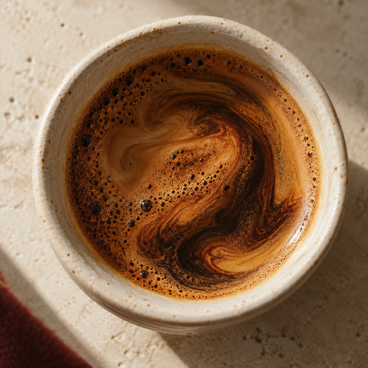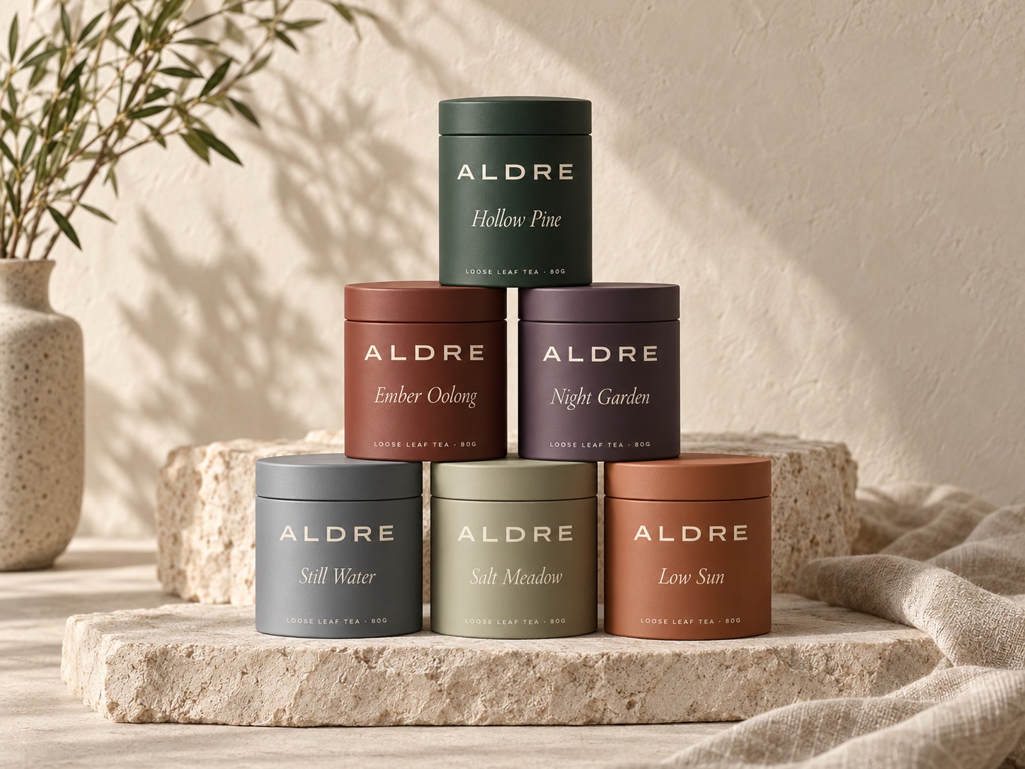
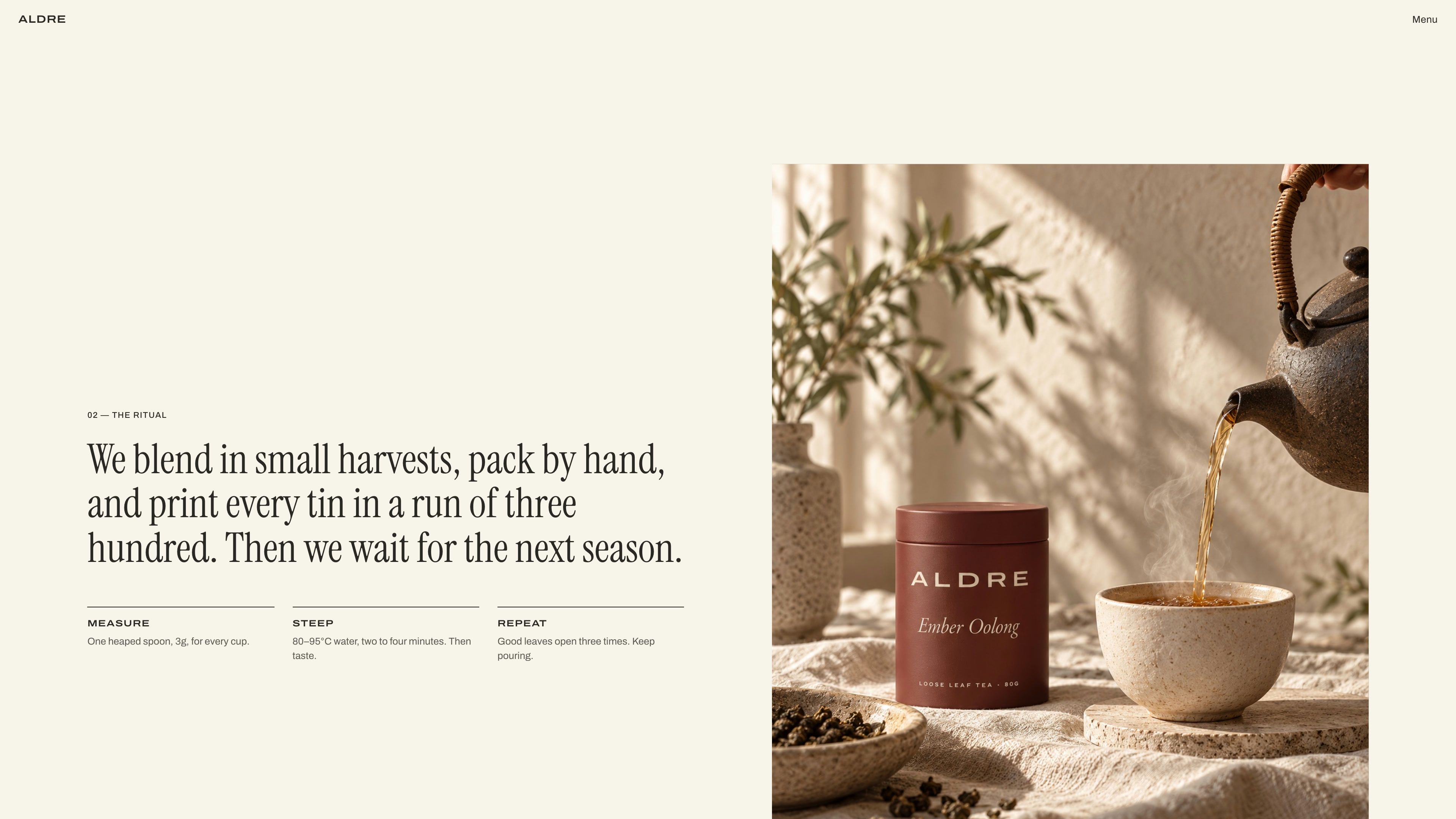
ALDRE is a concept for a small tea house that blends loose leaf in short harvests and packs every tin by hand. Tea brands often look either clinical or folksy. This one is quiet and tactile: stone, linen and plaster, a wide extended grotesk for the wordmark and labels, an italic serif for the blend names, and a palette of cream, sage, ink and mist, with each blend given its own tin colour.
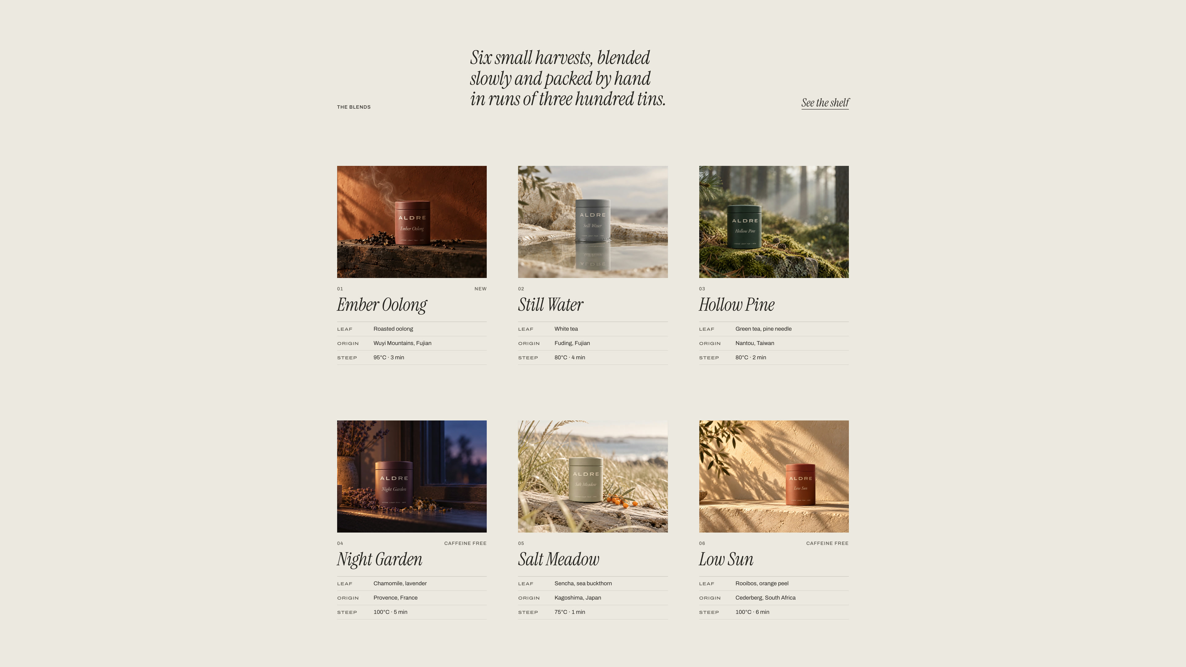
The structure comes from an editorial studio site, translated for tea. The opening scatters the five letters of the wordmark to the corners of a dark screen, pulls them together across the top, then opens a photograph of the tins on stone plinths from a single line. Below it the six blends sit in a catalogue grid, each with a framed plate and a small tasting card.
A studio site would list services here. A tea house lists what a buyer checks before they brew, so each card gives the leaf, the origin and the steep: water temperature and time. Hovering a blend eases the photograph forward, and three of them swap to a second shot of the leaf.
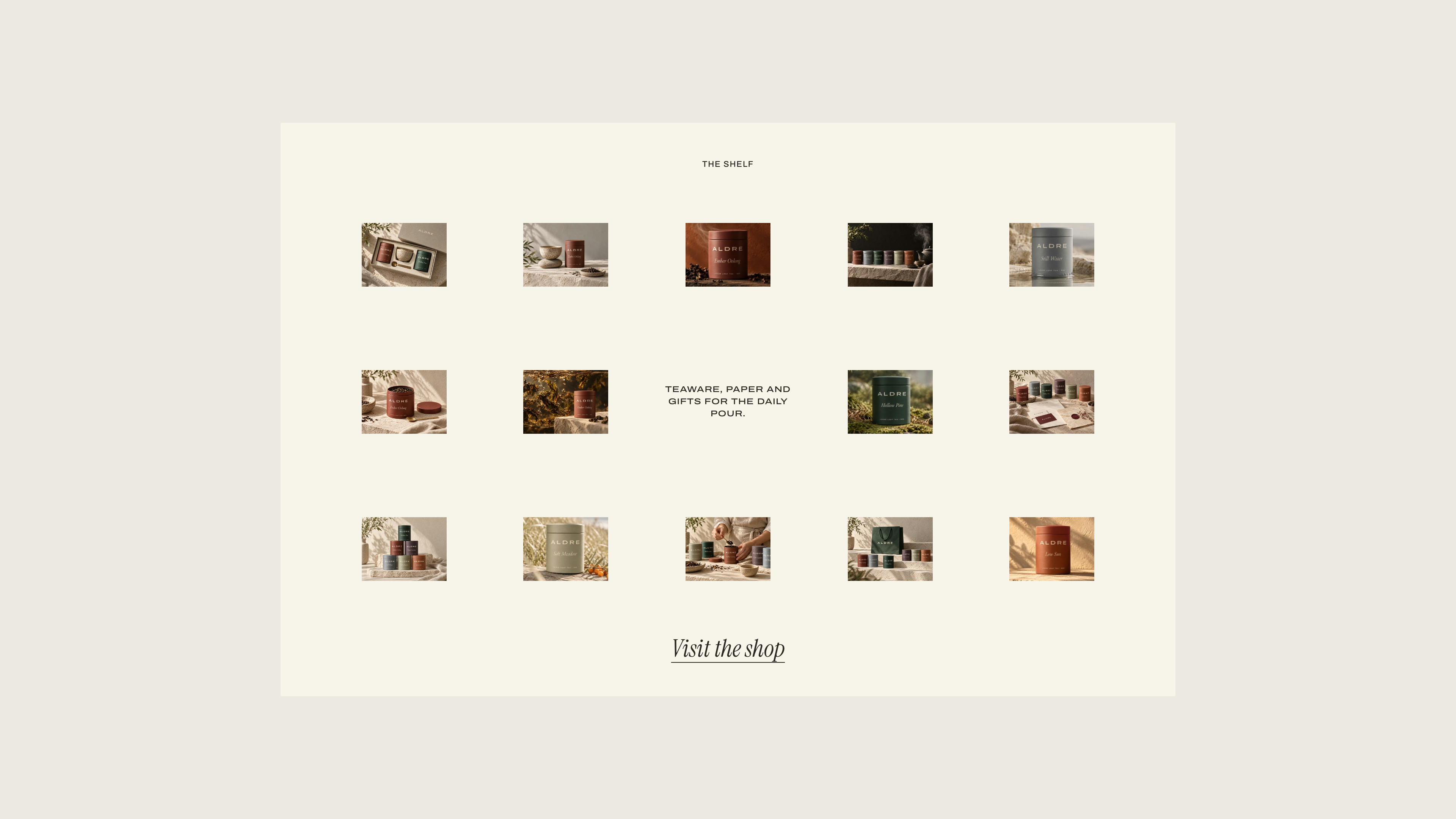
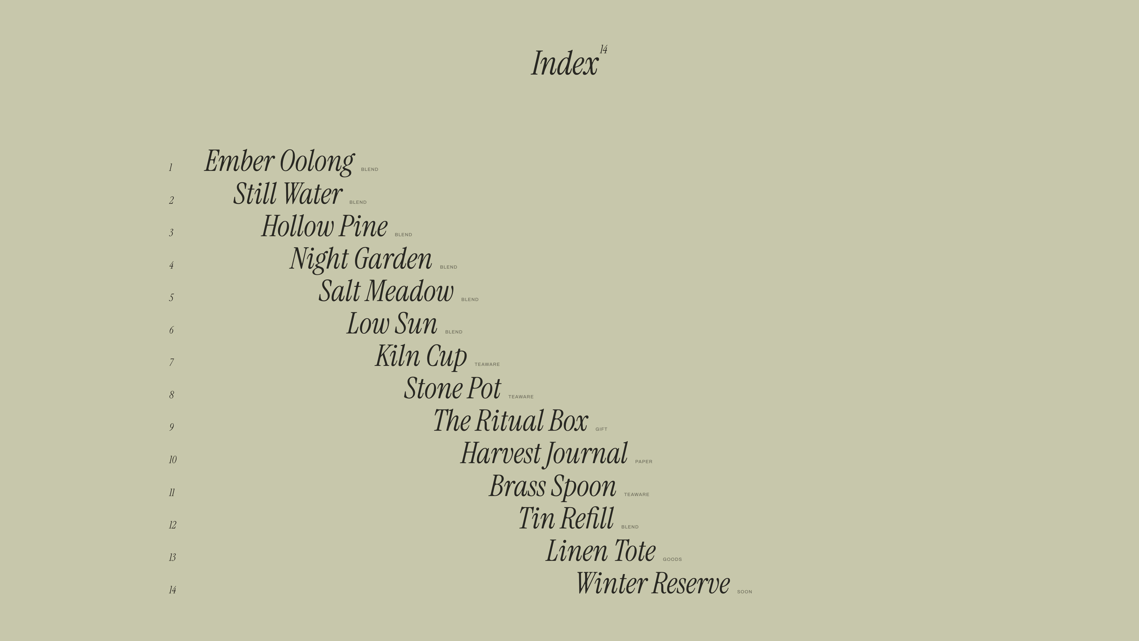
The rest of the page stays calm. The Shelf is a paper panel holding fourteen small photographs around one line of text, which fade in one after another and show their name on hover. The Index lists every product in staggered italics with a preview that follows the cursor down the rows. The menu sets Shop, Ritual and Contact in large type over a photograph that changes with each word, and the logo switches between ink and cream depending on what sits behind it.
All imagery was art directed and generated for the project from one prompt system, with the same matte tin, cream wordmark and soft side light in every shot, so thirty photographs read as one shoot. The showcase film is a real recording of the site in use, 59 seconds from the opening letters to the end card, with the cursor, menu, hovers and reveals running as they do in the browser.
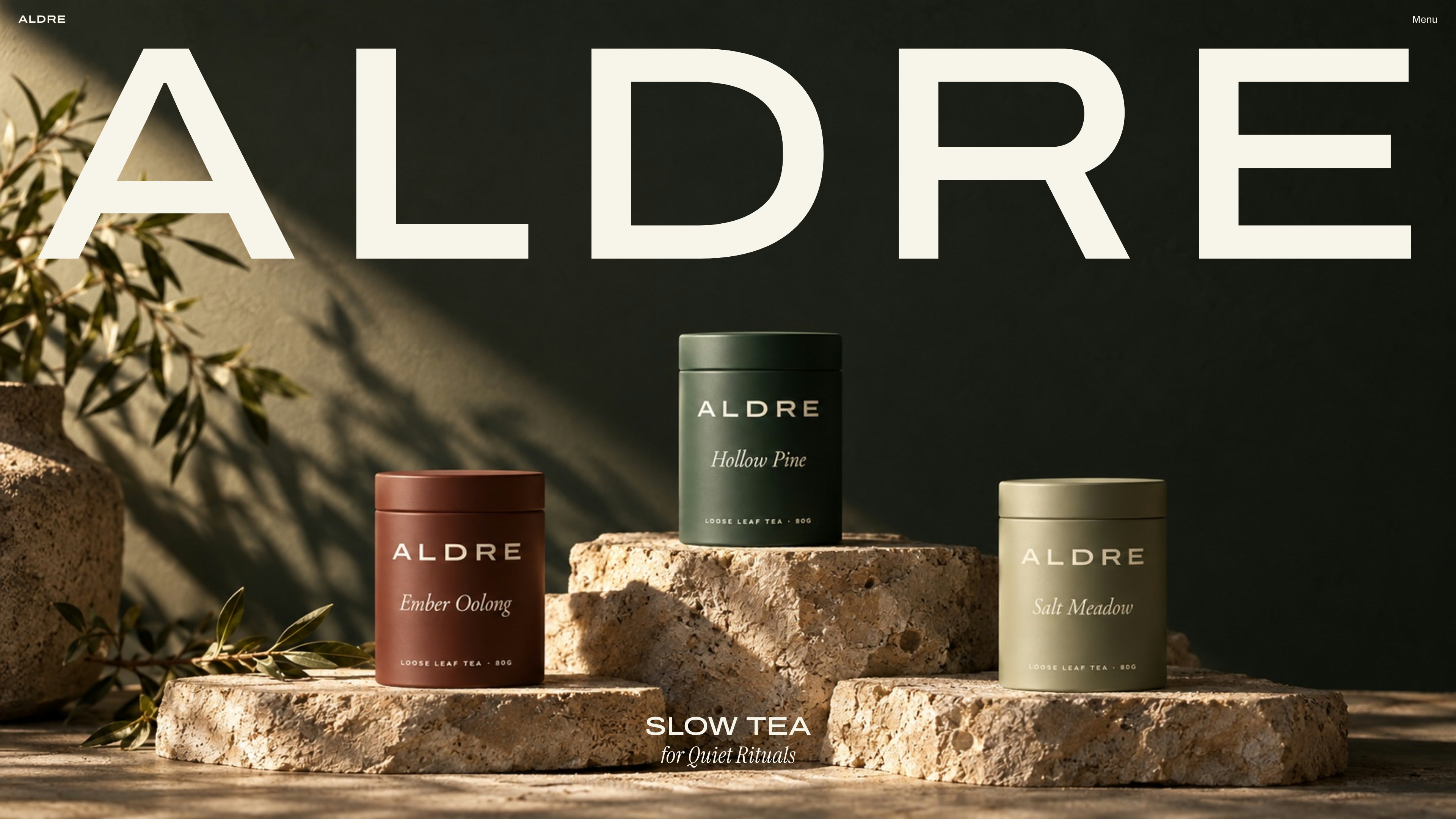
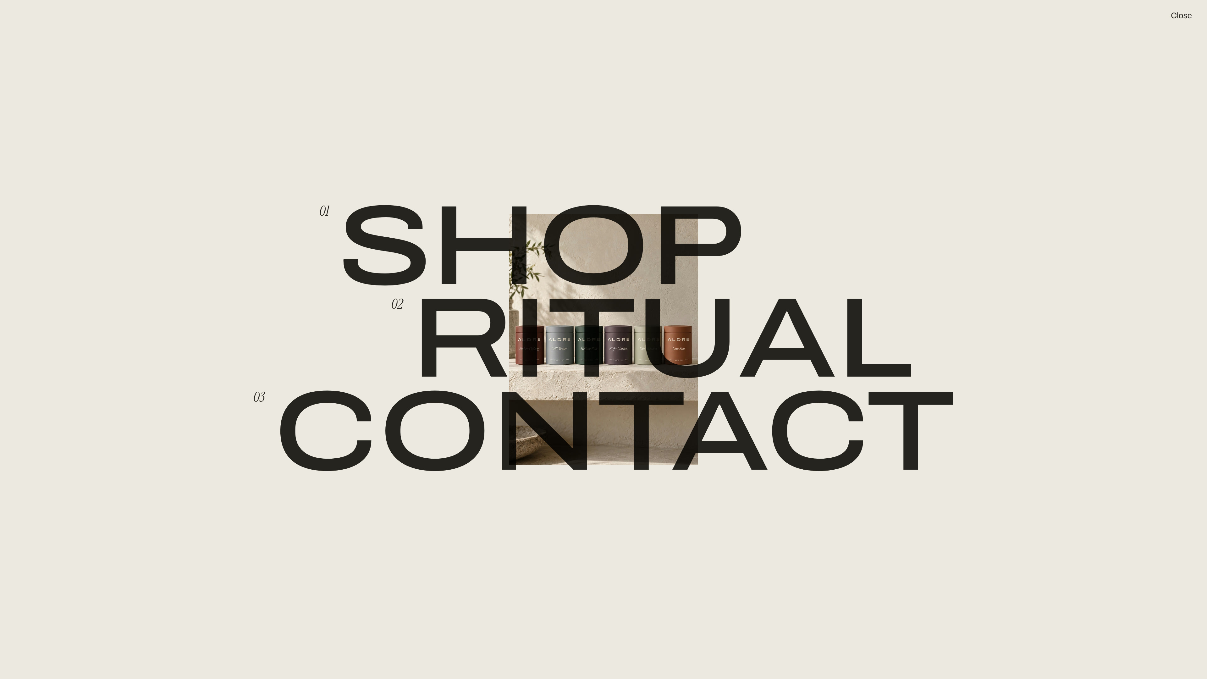
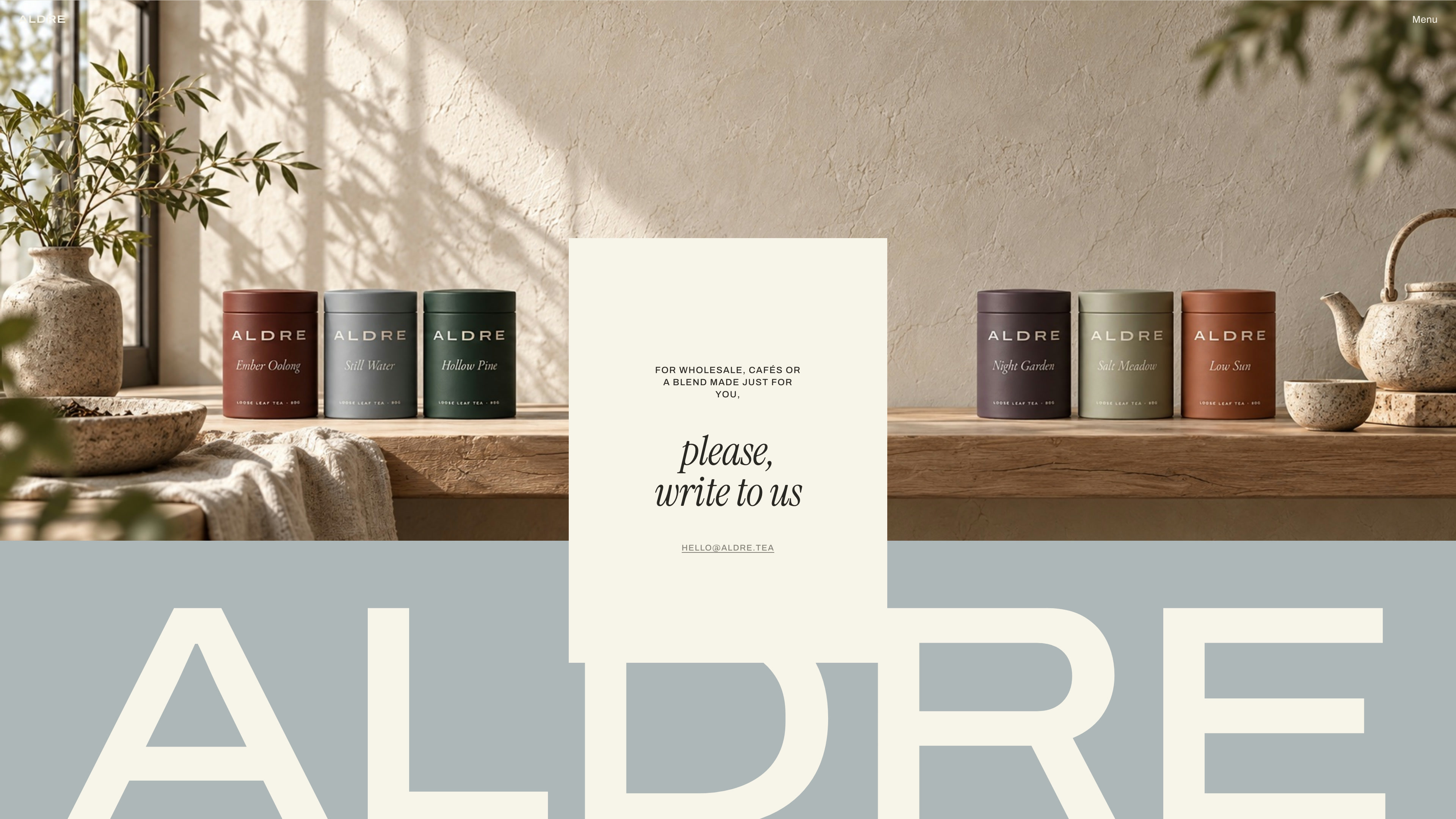
This is the live build. Scroll inside the frame, or open it full screen to see the opening, the menu and the hover previews at full size.
At phone width the wordmark still flies in across the top, the blends drop to a single column with their tasting cards intact, and the Shelf settles into three columns with its line of text moved to the top. The hover previews switch off because there is no pointer. Each phone above scrolls a different part of the same mobile page.
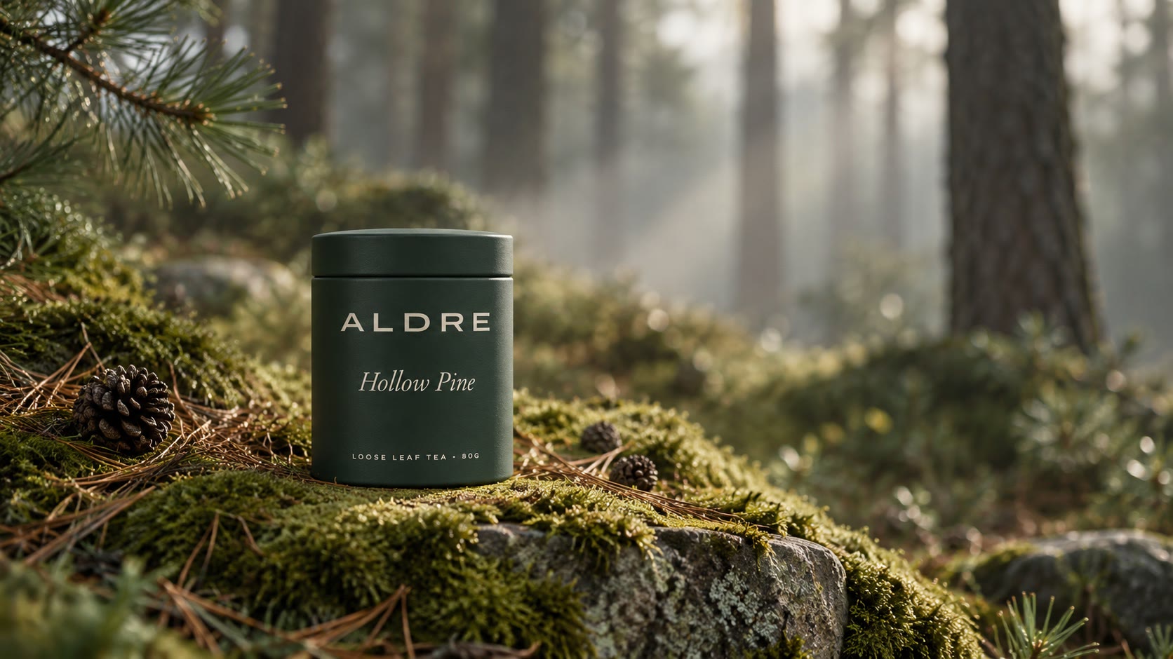
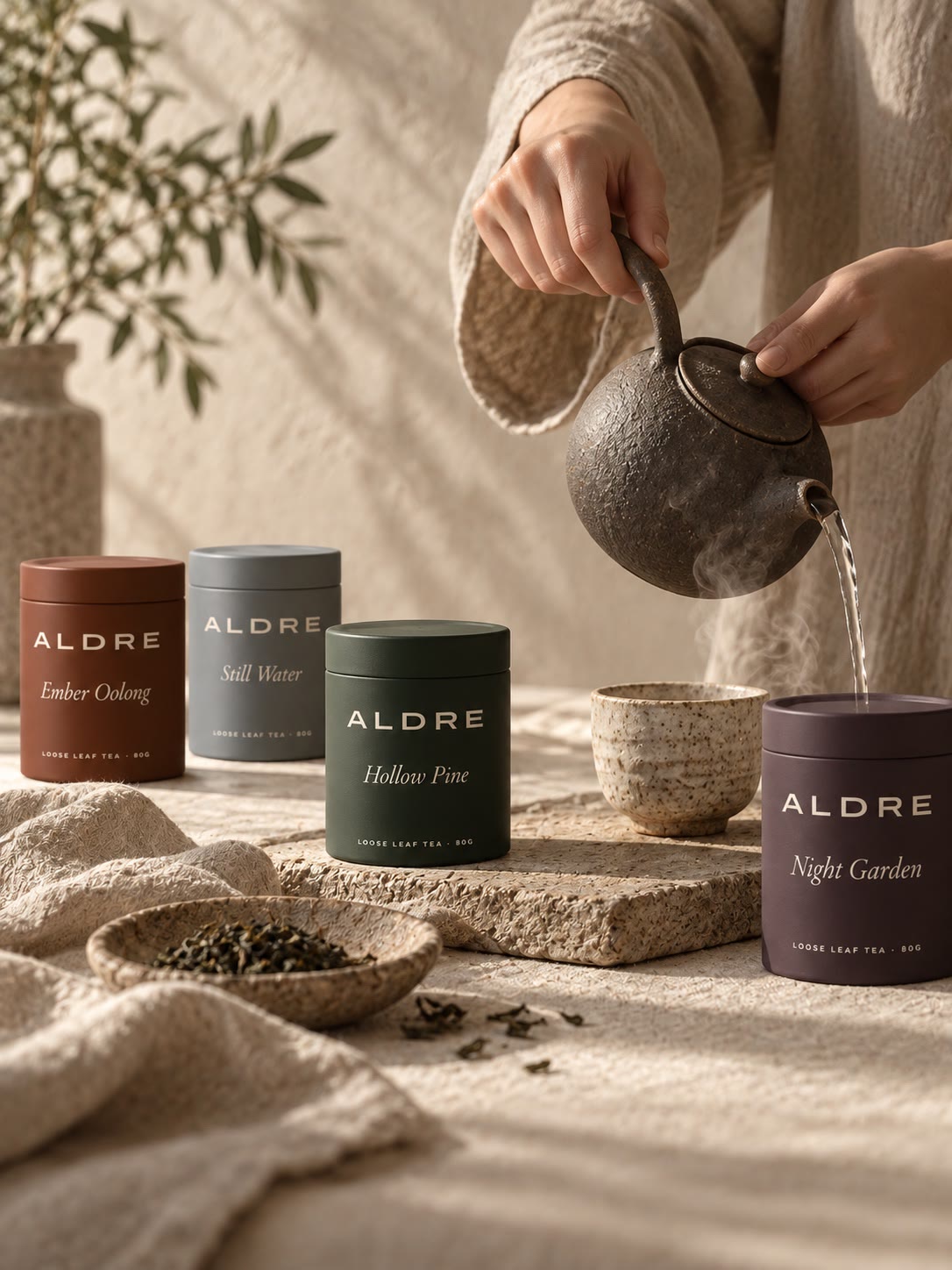
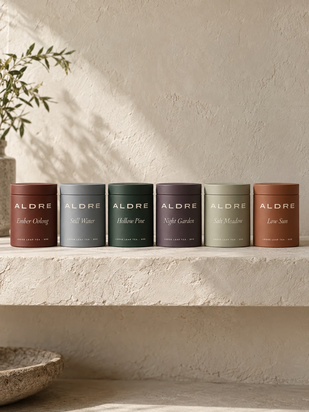
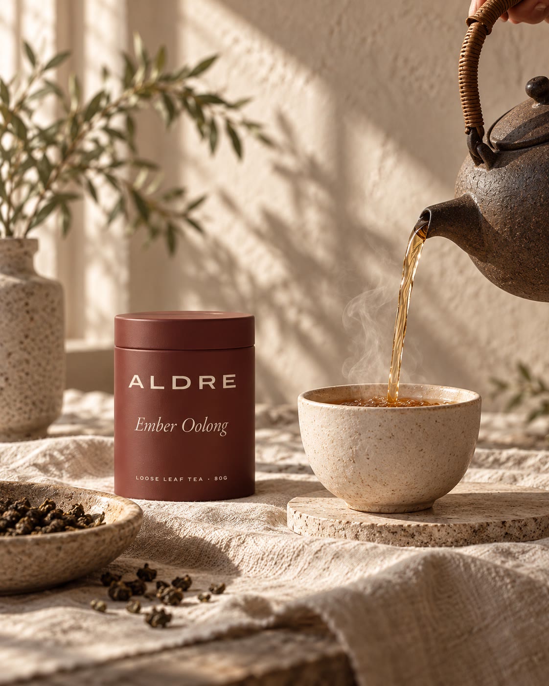
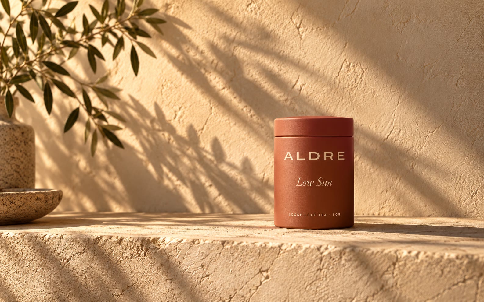
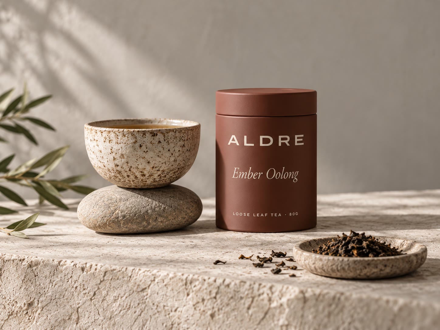

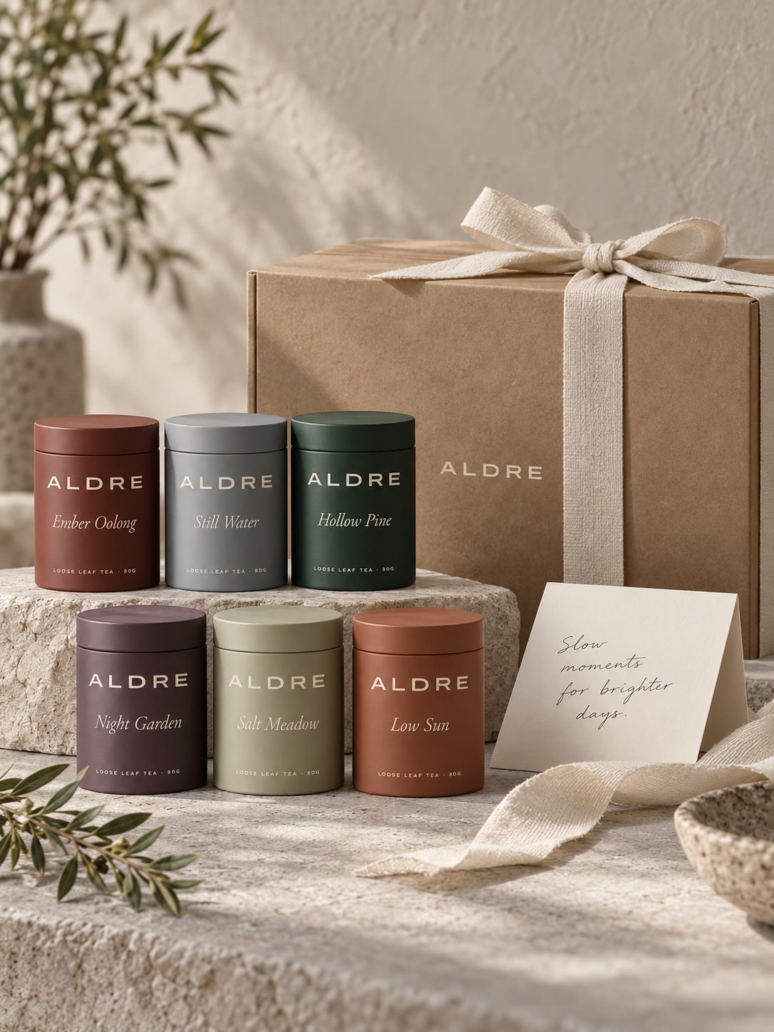
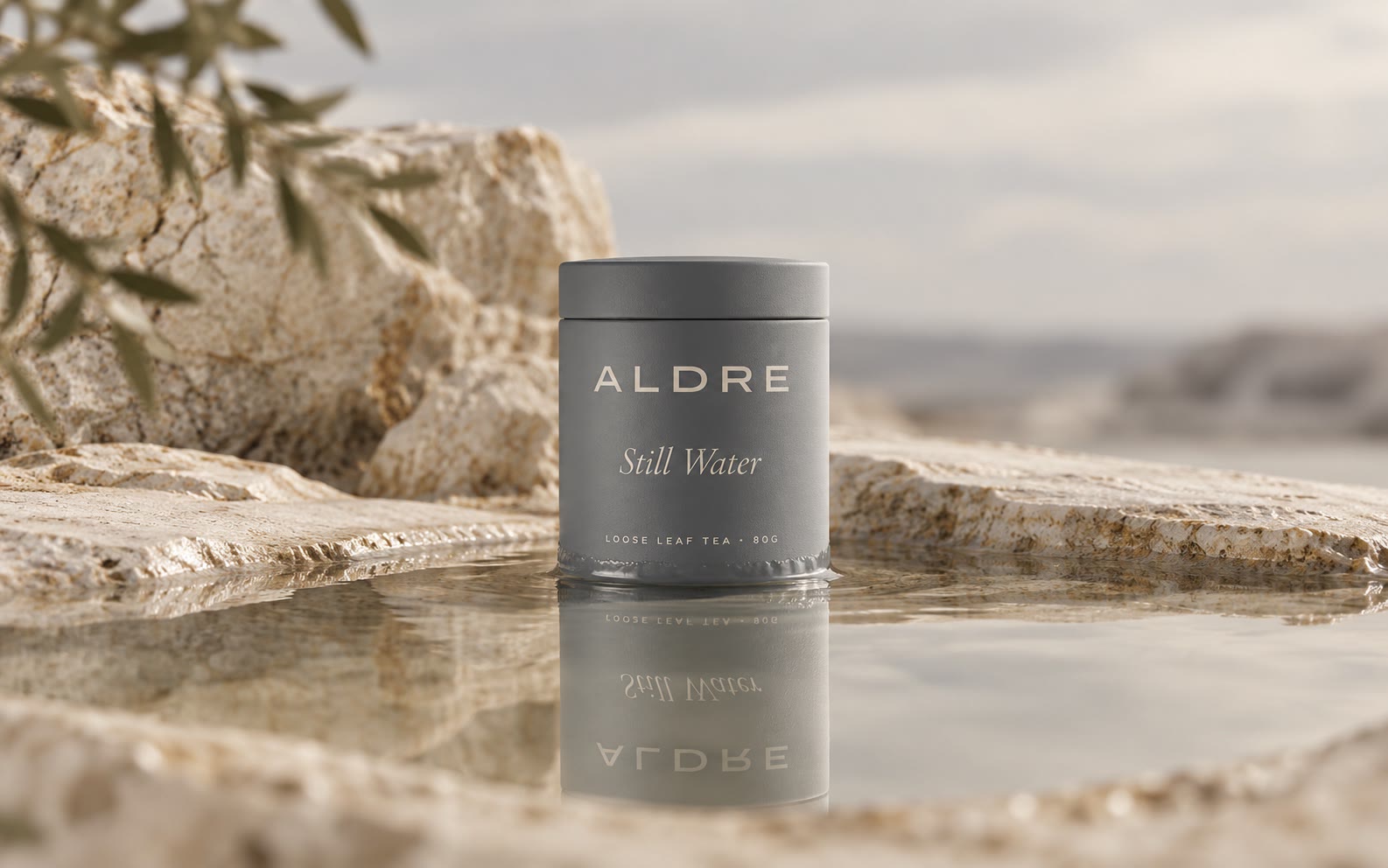
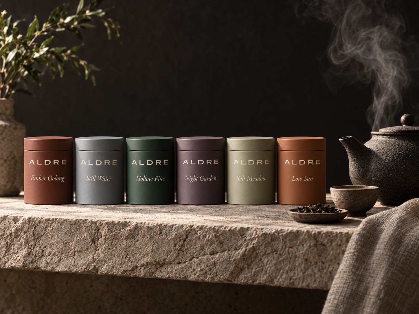
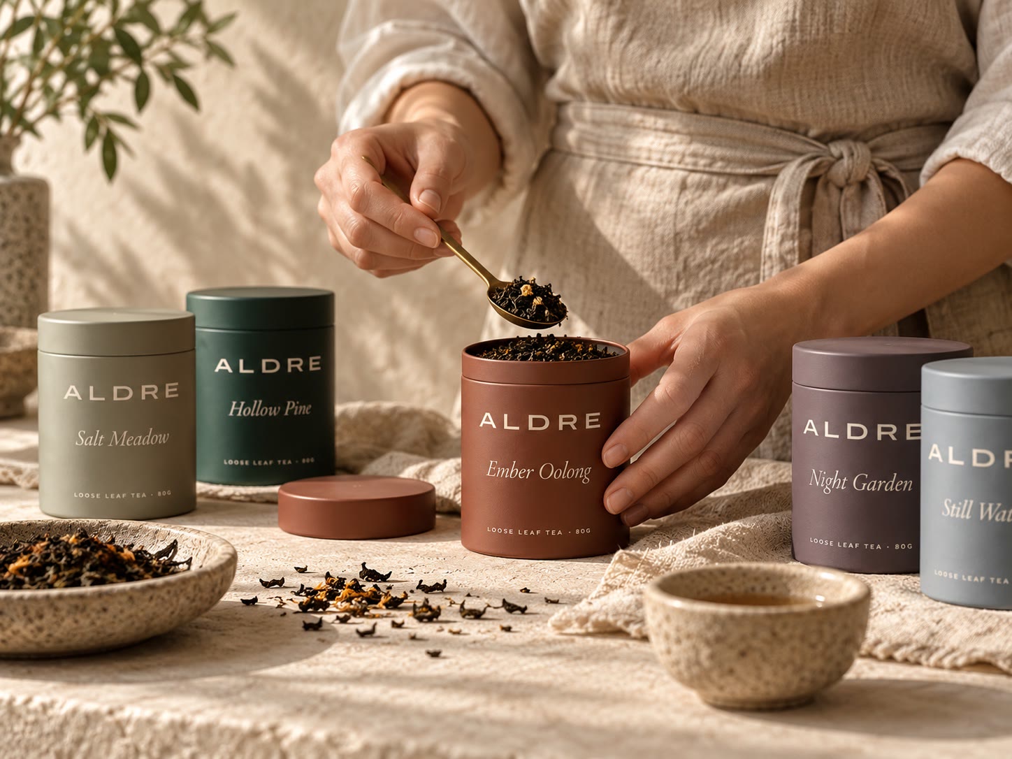
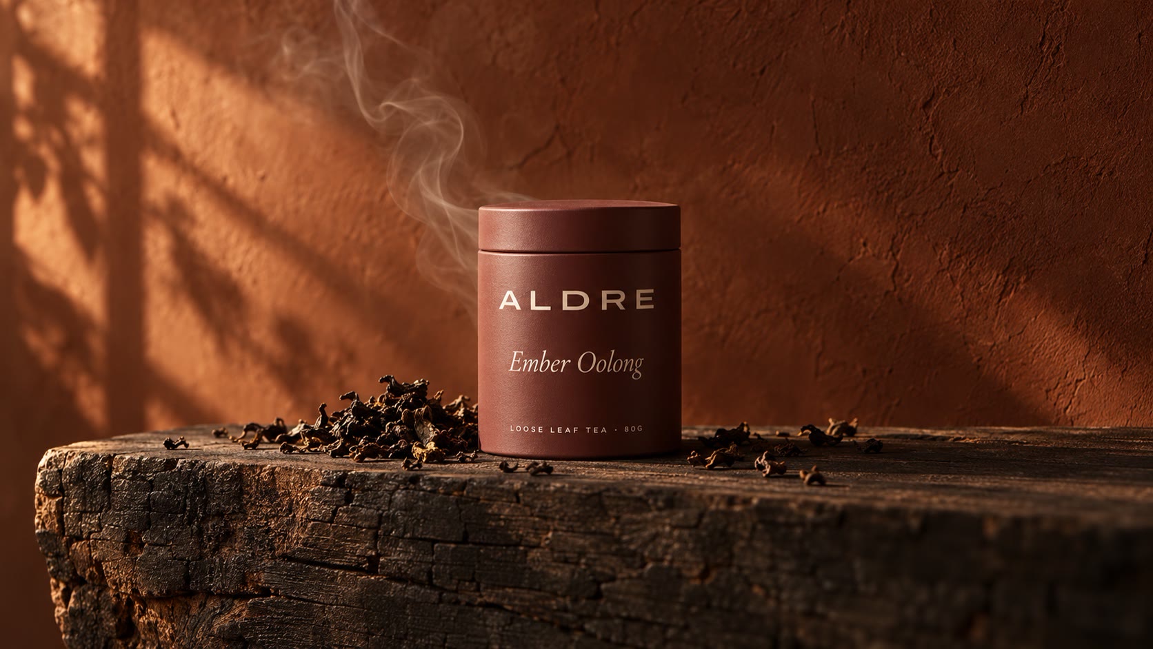
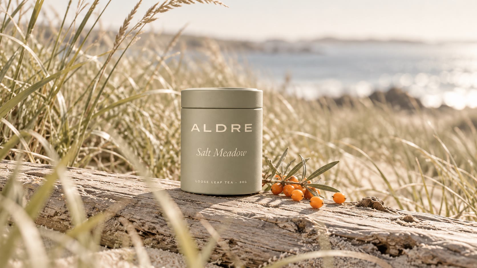
Thirty photographs, art directed and generated from one prompt system so the tins, light and palette match across the site. A selection is shown here.